STATEMENT
For what became a very complex project which was well over a solid year in the making, the statement of the drawing is very simple:
There is a royalty to Life: yet the path of Life to redemption contains an intricate web of pain, suffering, and experience.
The color blue in the drawing is meant to represent Royalty, Beauty, and Goodness and serves very much in the 'silver lining' sense as there's not much of it in the drawing. Other than surrounding the large letters of "Life" that make up the center of the drawing the only other blue is the blue writing that surrounds the very last sentence of the drawing - a passage from Revelation 22: "And they shall see his Face..." To read across the drawing in blue the message is simply: "Life - and they shall see his Face." In this sense the red and all other details in the drawing are meant to fade into the background of this over-arching yet very simple message.
The red symbolizes the ever-present oppositions in our lives that sprinkle pain and hurt on us every day: even the very best of days. As much as we may not like it, a large part of lived experience is negative - hardships, fears, anxieties, depressions, angst, hatred, etc. Life must engage all of these things directly, but it cannot become so ensnared in them that Life itself is lost: our lives must rise above and work through those hurts and pains by the power of Jesus Christ working through the Holy Spirit to bring us into communion with the Father.
The black in the drawing is the neutral color: some positive things are written in black and some negative. The white is generally neutral as well, partaking in both positive and negative themes of the drawing
SCRIPTURE
There are six sections of scripture in the drawing: two from the Hebrew Bible (aka Old Testament, Tanakh) and four from the New Testament. I will list the scripture reference, followed by the location in the drawing in parentheses, and then the verse(s) themselves (all in English) below the reference (these will be listed in the order that I put them in the drawing).
Numbers 6:24-26 (Hebrew text at the top left of Drawing #2):
"The LORD bless you and keep you;
the LORD make his face to shine upon you and be gracious to you;
the LORD lift up his countenance upon you and give you peace."
Matthew 6:25-34 (English text in black surrounding the cube on the far left lower part of the drawing)
“Therefore I tell you, do not be anxious about your life, what you will eat or what you will drink, nor about your body, what you will put on. Is not life more than food, and the body more than clothing? Look at the birds of the air: they neither sow nor reap nor gather into barns, and yet your heavenly Father feeds them. Are you not of more value than they? And which of you by being anxious can add a single hour to his span of life? And why are you anxious about clothing? Consider the lilies of the field, how they grow: they neither toil nor spin, yet I tell you, even Solomon in all his glory was not arrayed like one of these. But if God so clothes the grass of the field, which today is alive and tomorrow is thrown into the oven, will he not much more clothe you, O you of little faith? Therefore do not be anxious, saying, 'What shall we eat?' or 'What shall we drink?' or 'What shall we wear?' For the Gentiles seek after all these things, and your heavenly Father knows that you need them all. But seek first the kingdom of God and his righteousness, and all these things will be added to you. Therefore do not be anxious about tomorrow, for tomorrow will be anxious for itself. Sufficient for the day is its own trouble.”
Ezekiel 37:5 (Large Hebrew Text beginning in the far upper right part of drawing #3)
"Thus says the Lord GOD to these bones: Behold, I will cause breath to enter you, and you shall live."
John 11:25 (English text in black surrounding the cube on the far right lower part of the drawing)
"Jesus said to her, “I am the resurrection and the life. Whoever believes in me, though he die, yet shall he live…" (the same verse is repeated several times to even out this cube with the cube on the left side of the drawing)
Revelation 22:1-3 (Greek text next to the large tree on the left of drawing #3)
"Then the angel showed me the river of the water of life, bright as crystal, flowing from the throne of God and of the Lamb through the middle of the street of the city; also, on either side of the river, the tree of life with its twelve kinds of fruit, yielding its fruit each month. The leaves of the tree were for the healing of the nations. No longer will there be anything accursed, but the throne of God and of the Lamb will be in it, and his servants will worship him."
Revelation 22:4a (English text at the very bottom right of drawing #3, surrounded in blue text)
"And they shall see his Face…"
SYMBOLISM/DRAWINGS WITHIN THE DRAWING/OTHER TEXT
At the foreground of the drawing is the large word "Life" but the real intricacy of the drawing is in the surrounding details. I will list here some of the detail elements of the drawing as well as specific locations that are drawn. It would be impossible to cover everything, but I will give a good sampling.
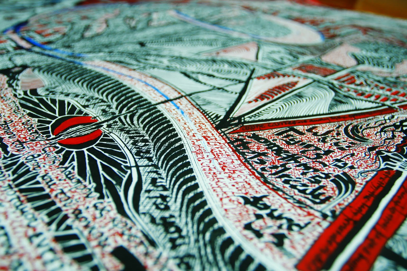
The largest single element in the drawing other than the word Life is the corridor that compositionally makes up most of the middle drawing. The tunnel that this is drawn after is a tunnel that links what used to be the Bear Stearn's building on Madison Ave in Manhattan to Grand Central Terminal (often incorrectly called Grand Central Station). I found the tunnel itself to be visually interesting, but the reason that the location was important to me is because when my wife and I first got together she was working at Bear and I was working at Li-Lac Chocolates which has a location at Grand Central. In this sense the tunnel serves more as a bit of nostalgia for me for when we first got together and when I first moved to New York - a period in my life that be a defining time for me for the rest of my life.
At the center (or really end) of the corridor is the Hebrew word YHWH which is the personal name for God in the Hebrew Bible. My statement here makes every attempt to be as clear as possible - being with God is the center, focus, and goal of the drawing. YHWH is also repeated within the cubes on either side of the drawing: I meant for this to be a unifying element of the three drawings as well as giving nod to the Trinity of Father, Son, and Holy Spirit. The cube in drawing #1 (on the left) was drawn to represent my cubicle at work and how ever there I want to try and serve God in every way possible (which I often fail at). The cube on drawing number #3 (on the right) is there simply as a unifying element for the drawing.
The Alpha and the Omega on the far right of drawing #3 references Revelation 1:8 and 22:13 where Jesus refers to himself as the Alpha and the Omega, the beginning and the end. Also on the far right side just under the alpha and omega is the Hebrew word 'elohim which is the general word for 'God' or 'Divine Being' in Hebrew and then right below that is just a single yod - referring to Matthew 18 when Jesus says that not one yod ('jot' AV) will disappear from the Law until all is accomplished.
There are also many "drawings within the drawings" that don't serve so much as symbols as they are simply locational drawings or drawings of important items. Many of these drawings within the drawing center on buildings and structures that are a part of lower Manhattan, specifically the World Trade Center and World Financial Center areas as this was the area that I worked in during the time that I was working on the drawing. There were so many different things going on in the areas - specifically the rebuilding of the World Trade Center - that when I'd get home I'd often want to draw what I'd seen during the day: both from views out of the World Financial Center and things that I'd see on my walk to and from work.
Drawings (and partial drawings) within the drawing include: a scene from besides the Thames River in London (bottom of Drawing #1), a view from our brownstone at the time of the drawing in Brooklyn (top of Drawing #3), the Barclay-Vesey Building, the brownstone we lived in at the time of the drawing, the Brooklyn Bridge, the Empire State building (twice), the new Goldman-Sachs building, and St. Paul's Chapel.
The hand in the bottom middle of Drawing #2 is supposed to be a gesture of desperation or of someone grappling with something, but nothing specific is in mind. The phrase 'Everything Burns' is partially obscured by the hand. The words written along the left side of Drawing #2 in large text are Fear, Passion, and Sorrow.
The smallest text (of which there is more than anything else in this drawing) I simply call 'filler text' - the tiny, mostly illegible writing that 'fills in' much of the drawing. I love text-based drawing and don't mean to say 'filler text' in a negative sense: in most cases it's my favorite part of the drawing. The filler texts are made up of personal thoughts, personal fears, personal struggles, repetitive sequences of words, song lyrics (often from whatever I was listening to as I worked on the drawing), personal desires, personal dreams, and rants. None of these texts are really meant to be read - in fact reading it all would be impossible because I put letters where 'filler' is needed, not in sequences of sentences and/or words. Very little of the drawing is meant to be read: the very first part of the first drawing was what I wrote in the far upper left corner: "It's not meant to be read..." In this way the filler text composes the real fabric of life experience: the consistent background that's often ignored in the big picture of life.


 I discovered this nib at Pearl Paint on Canal St. in Manhattan and it quickly became the nib that I used the most: replacing the previous nib which after a while I found to be too unstable. I felt much more in control with this one, and it felt stronger in general. I also find this nib to be difficult to find, so after I finished Life #3 I went and bought 18 more of them (fortunately they're also really cheap - only $.29 each).
 This is a 1/4 inch ink brush, and one of my favorite nibs (although I probably used it the least overall). This is good for thick, heavy lines: for example, the outline of the text tree in drawing #2 and #3 and the heavy radiating lines on the left side of the tunnel that dominates drawing #2. I would also use this to get blobs of ink on the drawing in key spots, and then I would pick the the drawing and while holding it verticle to the table I'd hit the drawing down to make the ink run down and across the paper.

 My favorite part about doing this kind of drawing is the repetative patterns: making the repeated line patterns that dominate quite a number of spots on the drawing was very therapeutic. Also, as odd as this may sound I really enjoy holding the pens themselves - I feel like in a way I'm stepping back into a different time where things were more elegant and computers hadn't even dawned on the horizon. There were four main types of pen holder that I used while working on the drawing. I started by primarily using the black pen holder on the far right (see photo) and then the small brown holder on the left for the smallest of details. As the drawing progressed more I used an older version of the black holder second from the left (which had cork near the nib) but that eventually wore out and I threw it away. Getting in to the third drawing I went back to mostly using the far holder: it's much more solid. Then with only a couple weeks left I switched entirely over to the blue holder. It has the same strength and shape as the black on, but the blue material has a sort of velvet texture to it which made it much more comfortable than the hard overly-smooth plastic. If I could create my own pen holder I'd probably like it to be made out of some sort of metal and a lot heavier.